


I don’t always care about special editions or director’s cuts of movies. My favorite version of BLADE RUNNER is the one that has the dreaded Harrison Ford narration on it. Sue me, I think it belongs there. There are exceptions, of course. Guillermo del Toro’s director’s cut of HELLBOY is the only version of that movie that makes sense to me. It’s the same with the extended editions of the LORD OF THE RINGS films. But it’s a case by case thing for me. I think the theatrical cut of TERMINATOR 2: JUDGEMENT DAY, one of the greatest films ever made, is far and away the best version of that movie.
So what made the monochrome edition of FURY ROAD matter to me as something I had to see? Well, for one thing, the use of color in cinema and the possibility of post-production manipulation of color that has evolved over the past 20 years has really changed how I am even allowed to think about this subject compared to how I thought of it in my formative years as a filmmaker. I grew up and did my first experiments as a filmmaker in an era in which, if you wanted something to look a certain way, it basically had to look that way on the set. There was no such thing as “color grading” as it is known today. All that stuff was controlled chemically or through color timing techniques that were all done painstakingly through physical processes and it was very limited. You had to know exactly what you were trying to get in post from the moment you started building a set or dressing a location. Because that was basically what you were going to end up with. There were tricks. Like getting that cool metalic look in TERMINATOR 2 by leaving a layer of silver on the film during processing – A technique I tried very hard to emulate in the digital processing of my own film, The Danger Element, but doesn’t come close because it simply wasn’t done the same way. Digital color processing just literally didn’t exist in my formative years.
I always liked that. I just kind of like the idea of going out there and photographing something and then that just being it. There it is. You are seeing what I saw when I filmed it. In an environment like that I always just kind of felt like, “Why would you film something in black and white?” But at the time, I didn’t really percieve a huge difference between the two things. Color films were much less obnoxious, color-wise, than they are today.
Today, nothing is done that way. Digital color grading is a fairly new invention (late-90s), but it is being used aggressively at this point. I would say obsessively. FURY ROAD was filmed using digital video and it was edited digitally, of course, a process I’ve been a proponent of since 2001. The effect of this, however, is that you can endlessly manipulate color, which means that almost nothing you see in a movie is anything like the reality of what was actually photographed at the location. I personally find this distracting and I no longer have an attachment to the choices made because they are arbitrary. The story of why the color of a film is a certain way is no longer fascinating to me because it’s literally just a choice somebody made. It could have easily been completely different. It doesn’t preserve anything about the images captured during production, so I don’t have much of a personal attachment to it. This means that the idea of watching the movie with different possible color grading choices is not only hypothetically easy to make possible, it’s something that captures my interest.
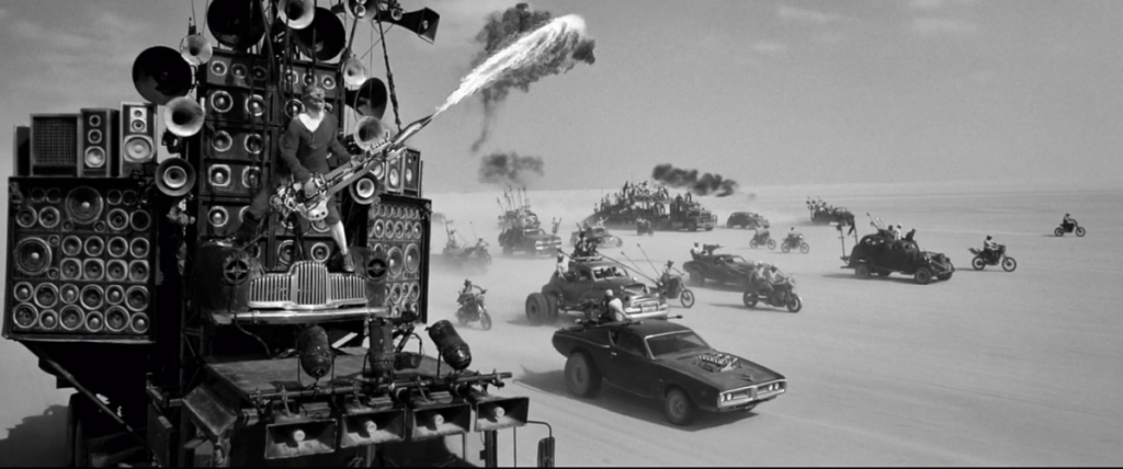
The other reason I was interested in the monochrome edition is the reasoning behind doing it. It started when Miller was making the original 3 films, starting with the original in 1979 (for 350 thousand dollars, I might add, to FURY ROAD’s 150 million.) Like I said, when those films were made, nothing was done the way it is now. In order to have freedom to try different things in the editing process, the film had to be copied onto “workprints” so that they could be phyisically worked with by hand, cut and spliced and repeatedly run through projectors and cutting machines, without damaging the print that would eventually be used to make the final edit. The workprints for the Mad Max films were all monochrome. Miller loved this and thought the movies should be released in monochrome. I always felt like the reasoning behind this is that the movies are so awesome that stripping down all the bells and whistles would only further highlight how awesome the content of the film is. Kind of a punk rock idea. That there is something about playing this thing through the shittiest amp we can find. That it’s just that good. His attitude about this did not change when he finally got to make the 4th instalment, FURY ROAD, 36 years later. He wanted to make FURY ROAD in monochrome, but, of course, Warner Brothers isn’t going to release a tentpole summer action film in black and white. Miller’s response to this was to push the color in the exact oposite direction using the new digital grading processes. The result is a color scheme that is shockingly vivid. It’s interesting, but it didn’t look like the old movies. Of course, this didn’t bother me all that much. It’s still the greatest action film to come out in like 2 decades at least. When I try to think about movies I’ve seen in the past 20 years, literally nothing comes close to it for me. It’s hard to criticize.
But when I found out that one of Miller’s contractual stipulations was that Warner Brothers release the film on home video in monochrome, I got interested. I thought there was a strange possibility that the film would look more like the original 3 films, even though they were in color. Something about subduing the colors, to me, made me feel like this was going to feel more familiar to me. This ended up being very true, to the point of almost moving me to tears a couple of times, but it goes beyond that.
Unexpectedly, seeing the monochrome edition of FURY ROAD solidified a very strong opinion in my mind. That this is the best way to watch this movie. I find it much less distracting. It feels much more like a single movie that takes place in a coherent world rather than a collection of obsessively manipulated images. The digital effects, already very smartly utilized, also work much better in monochrome. They don’t pop colorfully off the screen at you, which seems to make them seem a lot more real. This is something I always felt about films that came out right as digital effects were being invented. I always felt like they felt more integrated into the world of the films they were in than they are today. Even when the effects were bad, they often still kind of felt like they were in the environment, whereas today I always feel like I’m looking at something that’s very detailed and very colorful, but that all of that is being blasted at me out of a canon rather than being part of the environment. But, again, that is because those things were being done before the advent of digital color grading.
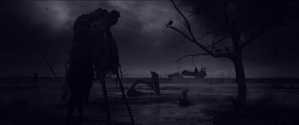
It’s also not as simple as just turning the color off on your TV or setting the saturation at zero. The film had to be completely re-graded, shot by shot, in monochrome. And it’s not simple black and white. It’s monochrome, but the color used varies from scene to scene. The night sequences are particularly astonishing and eerie and comepletely unique in color from the day scenes.
It was already pretty much my favorite film in decades, but I do have to strongly recommend watching this version of it. It’s a different movie.
